Pie Chart Phobia?
GoodReader Avoids Pie, But Does This Serve the Reader?
This overly elaborate infographic presents the same information as a classic pie chart or even a table. Does it do it better? I think not.
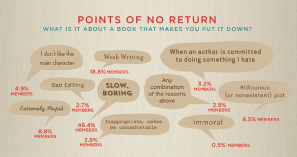
It could be that the publication thinks a classic pie or table does not match the image they want to present. Unfortunately, this chaotic presentation makes it much harder for the reader to make sense of the information.
Either a pie or a table sorted by percentage would quickly communicate the top reasons for quitting. This presentation leaves the reader hunting for key information. Why this jumbled spatial arrangement?
The leading factor is labeled in slightly larger type and bolded, but the significance is lost in a sea of bad typography. No typographic hierarchy is maintained in the rest of the labels. Why so many crummy fonts?
Say, what makes you stop reading an infographic?
“We live in a data-driven world where the ability to create effective charts and graphs has become almost as indispensable as good writing.”
— Donna M. Wong
Effective Visuals...
- Accelerate Communication to Time-Pressed Subscribers
- Improve Comprehension of Complex Issues
- Empower Subscribers to Do Their Own Thinking
- Deliver More Value Than Pages Full of Blablabla
