Archive
Reality Inverted
Reuters graph implies the opposite of what’s really happening
Graphics — especially simple graphics— should take into account reader’s expectations, not require careful study to correctly interpret their meaning. This Reuters graph inverts the vertical axis, creating the impression that deaths went down when in fact deaths went up. This graph runs counter to a well established convention that y-values increase from the bottom to the top of a graph. Breaking convention produces a graph that seriously misleads. A redrawn version of the graph instantly delivers the correct impression.
Be Your Own Expert
Trefis graphically presents its analysis and invites you to tweak it
Trefis graphically presents the components of its forecast, showing how they add up. Clicking on a component drills down to display the assumptions. That alone would be noteworthy, but Trefis goes one step further: the various trend lines are easily adjustable, allowing the viewer to both enter their own expectations and explore different scenarios. Instead of taking a forecast at face value, this permits every customer to dig deeper into the analysis and to develop their own personal forecast, based on their understanding and beliefs.
Linear Extrapolation
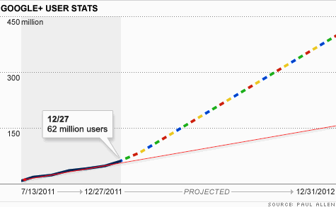
Google makes a very optimistic projection
Drawing a straight line through the existing data, I get 150 million, Google projects 400 million.Who’s better at line drawing?
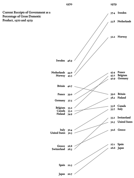
Edward Tufte’s ‘Slopegraphs’
In his 1983 book The Visual Display of Quantitative Information, Edward R. Tufte displayed a new type of data graphic. He was completely ignored.
Last month Tufte reintroduced the graph to the world, now christened as “Slopegraphs.” “Slopegraphs compare changes over time for a list of nouns located on an ordinal or interval scale.”
Charlie Park followed up with an extensive examination. “Any time you’d use a line chart to show a progression of univariate data among multiple actors over time, you might have a good candidate for a slopegraph.”
Financial Times’ iPad Dashboard
 http://app.ft.com looks and acts like an iPad app, but it is actually an HTML5 web page.
The advantage for the publisher is not having to endure Apple’s approval process, not having to pay Apple a 30% commission, and the ability to market content outside of Apple’s overcrowded App Store.
It is also much less costly to develop a Web page than to program a complicated app from scratch.
HTML5 Web pages also have the potential for reaching a wider audience. An app will be tied to a single type of tablet computer. An HTML5 Web page will be instantly viewable on any device that supports the new HTML5 standard.
Thanks to the capabilities of the new HTML5 standard, FT’s presentation can be made with few compromises. A large amount of critical and almost up to date (delayed 20-minutes) data is made available in a single convenient dashboard.
This page of Market Data is navigated using standard iPad finger gestures. The various information panels are interactive, enabling the reader to scroll through the data, focusing on what interests them.
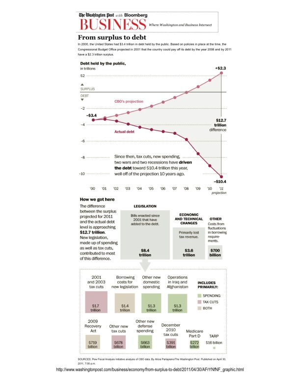
Economic Reporting: From surplus to debt
Washington Post/Bloomberg
- Light on text, this display emphasizes the data (stress on authenticity)
- Graphic timeline quickly summarizes the key issue
- Block chart is superior to pie charts (area is proportional to $ value)
- Color is used to present a third information axis (cuts vs. spending)
Environmental Reporting: “Our Choice” iPad App
iPad & Pop Push Press
“Years ago I shifted from making speeches about climate to presenting slideshows precisely because the complexity of the material makes it easier to communicate with pictures. Interactive infographics make it easier still” — Al Gore
Gore’s latest book, “Our Choice: A Plan to Solve the Climate Crisis,” has been transformed into an interactive iPad app. Pop Push Press enhanced the 400 pages from the print edition of “Our Choice” with a ton of mixed media based features to get readers engaged in the content, adding: images, more than 30 interactive infographs, over an hour of documentary footage with narration by Gore. The app will retail for a special price of $4.99 for a limited time in the iTunes store.
More at http://ti.me/kOApDA
Providing Daily Graphic Insights: CHART OF THE DAY
The Business Insider, Inc
Why The US Should Never Have To Default. Ever
All of this talk of default or technical default has the potential to unnerve markets, but here’s the good news. There’s really no reason whatsoever the US should default. Here’s why. Treasury receipts dwarf interest coupon payments, which are tiny. Only some bizarre legal technicality unrelated to the debt ceiling should be a problem.


