Archive
Overstacking Bars
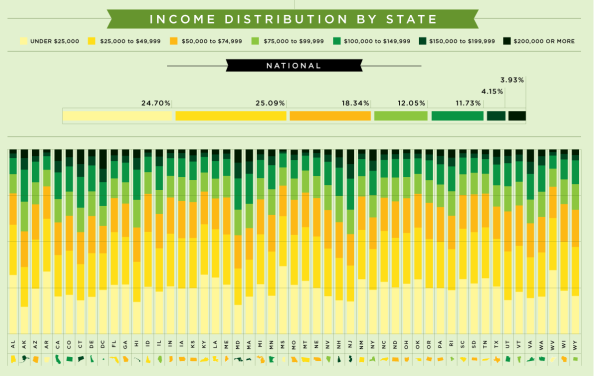
Mint goes too far with a stacked column chart
This stacked column chart is certainly pretty, but falls down on usability. It does not make it easy to compare income levels across states. Reading across the bottom it works for the lowest income group and reading across the top it works for the highest. For the five groups in between it does not work at all because there is no common point of reference. It is very difficult to compare an inner bar to any other inner bar.
This infographic would be less pretty, but far more useful if each group was displayed in its own row with a common zero line. Then the eye could easily scan across to spot the highs and lows.
The lesson is that a stacked column or bar chart can be useful at times, but only when a small number of comparisons are made or when the differences among the bars is very evident. Otherwise, don’t do it!
Spiral Charts
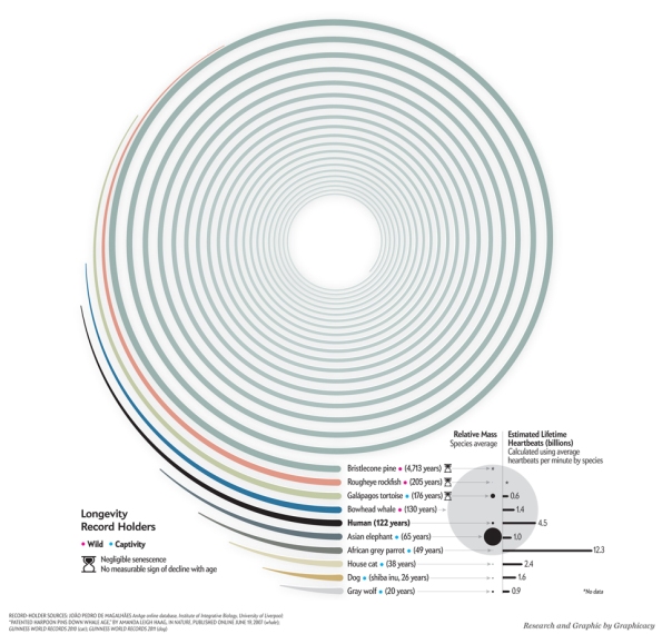
Scientific American plots hugely dissimilar values.
When some values in a bar graph are very large and others are much smaller it is difficult to discern the differences. All of the small values produce bars that are barely visible so there is no way to see the differences among the small bars. The spiral chart solves this by bending the bars. The high values spiral around and around. Differences in the low value bars are still clearly visible.
“We live in a data-driven world where the ability to create effective charts and graphs has become almost as indispensable as good writing.”
— Donna M. Wong
Effective Visuals...
- Accelerate Communication to Time-Pressed Subscribers
- Improve Comprehension of Complex Issues
- Empower Subscribers to Do Their Own Thinking
- Deliver More Value Than Pages Full of Blablabla
Recent Posts
Categories
- Charting (45)
- Dashboard (5)
- Data Journalism (21)
- FAIL (14)
- Inspiration (28)
- Interactive (9)
- Problem Solving (2)
- Social Media (3)

